Pixel Perfect and Pointless: Why Your Fancy WordPress Site Looks the Same on Every Phone
The Illusion of Pixel-Perfect Glory
You spent 30 days building the perfect website. You fine-tuned every margin, obsessed over every pixel, dropped in Elementor sections like you were composing a symphony—animations, counters, hover effects, the works.
Your theme? $89 of “modern elegance” from some designer who thinks “above the fold” means 4 sliders and a slow-motion scroll reveal.
You previewed it on your 27″ 4K monitor and thought, “Wow, this is going to change the game.”
But then Chad opens it on his cracked iPhone with 3% battery at a gas station in rural Alabama.
The font’s too small, the image is cropped weird, and the whole thing lags like it’s running through a potato.
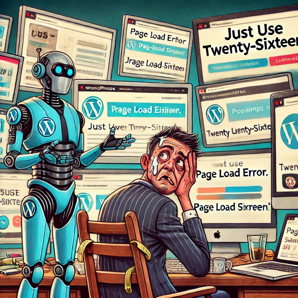
You should’ve used WordPress Twenty-Sixteen.
At least it would’ve loaded before the visitor gave up.
Meanwhile, your customers are thinking:
- “Where’s the actual content?”
- “Why is this so hard to read?”
- “Why does this look like it was designed for a billboard?”
- “You realize we do Net 90, right?”
You didn’t build for them.
You built for you.
Because agencies aren’t selling performance anymore—they’re selling sparkle.
Flash and fluff.
And while you’re busy admiring your own hover transitions, the average user is just looking for a phone number.
Let’s talk about why your site—despite all the glitter—still looks exactly like every other mobile site out there.
And why none of it matters.
The Builder Buffet Nobody Asked For
Ah yes, the WordPress builder ecosystem—where every plugin claims to “revolutionize” web design, and all of them secretly want to turn your website into a molasses-drenched pop-up nightmare.
Let’s take a stroll through the builder buffet line, shall we?
- Elementor – The fan favorite. Powerful, flexible, and bloated enough to slow down NASA servers.
- Divi – Looks beautiful until you try to remove it, at which point your entire site implodes into shortcode soup.
- WPBakery – Still hanging on, like a VCR in the age of streaming.
- Oxygen, Breakdance, Brizy, SeedProd, Visual Composer – All promising speed and control… until you realize each one just reinvents the same wheel with different bloatware.
- And of course… Gutenberg. The one you have to use, but nobody wants to actually use.
They all say the same things:
“No coding required!”
“Drag and drop everything!”
“Limitless design potential!”
Translation:
We’ve crammed so many scripts, widgets, and unnecessary animations into your page that it now loads slower than a government website on dial-up.
Oh, and the best part?
After you spend weeks building with one of these tools, you’ll inevitably try switching to another one and have to rebuild everything from scratch.
Because none of them play nice with each other.
It’s like a family reunion where everyone hates everyone else’s CSS.
And what does your user see?
A headline.
Some buttons.
And a contact form that probably doesn’t work on their phone.
But sure, that section fade-in with the springy easing curve really sets the tone.
Theme Forest or Theme Swamp?
Ah yes—ThemeForest, the jungle of digital design dreams, where you’re lured in by sleek screenshots and demo sites that load once, beautifully… under ideal lab conditions.
You pick a theme with 4,000 five-star reviews, 12 homepage layouts, 200 inner page templates, a built-in slider, three custom widgets, its own font loader, a theme panel from hell, and more shortcode spaghetti than an Italian dinner.
And for what?
So you can build the same site every other business in your niche already has… but slower.
Let’s break it down:
- You wanted clean and modern. You got layered fluff and 12 plugins you didn’t ask for.
- You wanted fast and mobile-first. You got four layers of JavaScript and a hero slider that takes six seconds to appear.
- You wanted flexibility. Now you’re afraid to update the theme because last time it broke your homepage and made your blog font Comic Sans.
Oh, and switching themes later?
LOL, good luck with that.
You’ll find out real quick that your carefully crafted design was actually duct-taped together with custom shortcodes and a visual editor that only works inside its own bubble of madness.
It’s like buying a mansion made of Jell-O: looks great until you try to move the furniture.
And again—what do mobile users see?
One column.
Big header.
Stacked buttons.
Endless scroll.
They’re not wowed. They’re just trying to find your hours of operation and wondering why the menu icon opens a full-screen overlay with 14 menu items and no “Contact Us.”
But don’t worry—it was “mobile optimized,” right? 😉
Mobile Reality Check
(Also Known As: Why Nobody Sees Your Fancy Stuff)
Let’s snap back to reality, shall we?
You didn’t build a website.
You built a desktop monument to your own design anxiety.
And then 90% of your visitors pulled it up on a phone and saw…
a vertical scroll of stacked content and sadness.
Let’s run the tape:
- That hero image you cropped so perfectly for widescreen? Now it’s a weird little slice at the top of the screen with some cut-off text floating in white space.
- That six-column layout you spent hours aligning? Now it’s six stacked icons nobody reads.
- That hover animation you were so proud of?
🤷♂️ “What’s a hover?” said every smartphone user ever. - Scroll-triggered fade-ins, slide-outs, counters, and effects?
Most users bounce before they ever reach them. - Oh, and let’s not forget the “Sticky Header of Doom” that takes up half the screen and blocks the call-to-action button you forgot to anchor properly.
And what does the user care about?
- A readable headline.
- A button they can tap without fat-fingering.
- Something that loads in less than 3 seconds so their phone doesn’t overheat.
They’re not here for design awards.
They’re here to find your hours, prices, reviews, or how to call you.
You know what wins on mobile?
👉 Plain text, a few strong images, and buttons that work.
Not your ultra-custom, CSS-massaged masterpiece with 19 content blocks that each took 45 minutes to position.
Mobile doesn’t care how hard you tried.
It just wants you to stop trying so hard. 😎
Section 4: The Dirty Secret—Simple Sites Convert Better
Here’s the truth no one selling $199 WordPress themes wants to admit:
Simple sites work. Fancy sites don’t.
That landing page with white space, bold text, a clear message, and a giant “CALL NOW” button?
Crushes.
That “award-winning layout” you copied from a Dribbble post?
Dies on mobile like a fish on dry land.
Let’s talk numbers (don’t worry, I’ll keep it short):
- Sites that load in under 3 seconds? 32% lower bounce rate.
- Clear calls-to-action = more conversions.
- Less clutter = more engagement.
Nowhere in that list does it say:
“Make sure to include three overlapping hero sliders with 16 navigation menu items and a sticky scroll-to-top button shaped like a raccoon.”
But go ahead, show off your “design flair.”
Meanwhile, your customer is five taps deep trying to find your contact info and getting hit with a pop-up that says:
“Subscribe for 10% off!”
…on a site that doesn’t sell anything.
People don’t want to be impressed.
They want answers.
They want direction.
They want to find your phone number without accidentally clicking an animated icon that opens a pop-up built in Elementor’s third-party popup plugin.
If you can give them that with a plain WordPress theme, clean content, and some decent font hierarchy?
You win.
If not?
Congrats. You built a beautiful site nobody uses.
Drop the Bloat, Keep the Brains
Look, we’ve roasted. We’ve ranted. We’ve dragged every bloated theme, sluggish builder, and misguided “designer” decision through the mud.
But let’s not just set things on fire—we’re here to rebuild smarter.
Here’s the truth:
Nobody cares how fancy your site is if it doesn’t load fast, read clearly, or get to the point.
Your visitors aren’t art critics.
They’re impatient, on a small screen, probably distracted, and trying to find something specific.
So give it to them. Fast. Simple. Clear.
✅ What Actually Works (a.k.a. What You Should’ve Done):
- Use a lightweight theme.
- Blocksy, GeneratePress, Astra.
- Or just lean into the minimalism and rock Twenty-Sixteen like a legend.
- Focus on content, not decoration.
- Clear headline. Helpful subheading. One obvious action to take.
- If it doesn’t add value or clarity, delete it.
- Design mobile-first.
- If it doesn’t look good on a phone, it’s already failing.
- Check every page on a real device—not just your browser preview.
- Optimize load speed.
- Ditch unnecessary plugins. Compress your images.
- Use caching and a decent host. (No, GoDaddy doesn’t count.)
- Limit your builder bloat.
- If you must use a builder, fine—but don’t let it run the whole show.
- Bonus: Learn some basic HTML and CSS. You’ll never be held hostage again.
- Put yourself in the user’s shoes.
- They’re not admiring your kerning.
- They just want to know what you do, if you’re legit, and how to reach you.
Because at the end of the day?
You don’t need parallax scrolls. You need purpose.
You don’t need a thousand layouts. You need one that works.
You don’t need a “modern experience.” You need content that matters.
You can either keep building for your ego—or finally start building for your customer.
And when in doubt?
Just use Twenty-Sixteen.
It still loads faster than 80% of the internet. 😉🔥


